Digipak draft 1- Front Cover

Before making the digipak, I took one of the panels from the
template and removed the writing on it so it was blank. I did this by putting a
white background behind the panel to fill in the gap that was made. The green
line was left in as a border, as the template says it is a safety line. I made
sure it was the right measurement, so this can be used as a template for most
of the panels (except for the CD holders as those panels are slightly
different.).
Front Cover

I started by finding a picture of a brick wall. This would
be the main image on my front cover. I got rid of the blackness (Magic Wand for the black areas and eraser for the rest) and the bars
above the wall so I could add the sky which I had planned on my initial hand
drawn version.

After Removing the sky, I tweaked the colouring slightly (CTRL and U),
adding a slight orange saturation so it would match the lighting of the sky. I
also tweaked the lighting to make it brighter (CTRL and L). I then added three blood streaks (Brush tool) forming a pool, preparing it for when I added the ZOMBIES III to the wall,and
some faint blood splatters.
Next, I found an orange sky to go above the wall. I altered
the lighting to make it darker, and then added it to the picture of the wall. I
think I got the lighting between the two images spot on here.


------>
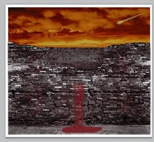
After this, I found a meteor and used a combination of the magic
wand and the eraser tools to remove the background. I also toned the lighting
down so it didn't look too bright and so it looked at home in my apocalyptic
sky.

I then added another couple of details- The hand print in
the lower right hand corner, and the Group 916 logo, which I will show my
method of obtaining later.

The next step was rather time consuming. The way I was able
to get a regular I in “zombies”, required careful erasing around a single I in
the original Zombies III logo. I had to make sure it looked smooth and not
sketchy in places. Once I was able to cut one out, I removed colour and changed
the lighting to match the other letters. Before I did this however, I
duplicated it three times and made the colour a more crimson shade of red, to
match the blood but at the same time stand out.
FINAL PRODUCT

This draft worked quite well and will probably end up being
my front cover, or at least the basis for it. After asking a few people about whether it
looks like an album cover, the responses were all positive and all said it
could appear on shelves in a shop.
No comments:
Post a Comment